Friday, February 28, 2014

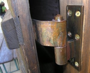
Observational Assignment: Interesting Joints


Themes:
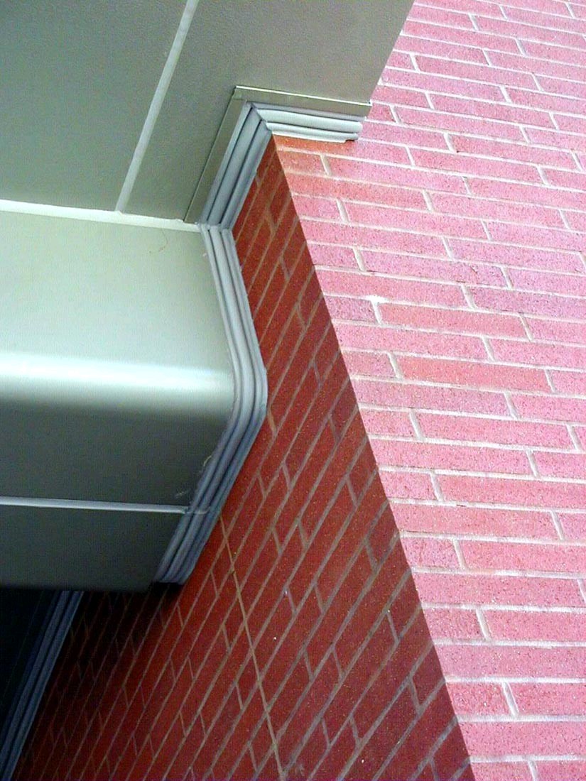
I noticed I was attracted to joints that were rounder and fit kind of perfectly together. I was attracted to them because joints are supposed to fit securely with the object and make a seamless connection between the two. When things fit nicely like they are intended to, it attracts the eye to the craftsmanship of that object.

Possible Artist Ramifications:

  • The weathered texture of the joints could be used to create artwork that resembles aged pieces. This  could be interesting if you made a modern object but made it look like it was made longer ago
  • Since joints can also refer to the human body, making a body out of metallic tubing would be a cool idea
  • By attaching something rough and angular to contrast the smoothness and cylindrical shape of the joining tube, you could make some really awesome contrasts in the work
  •  An artist I've found that works with tubing and has mastered joining them in a seamless way is TJ Volonis. He intricately designs the copper tubes he uses in magnificent forms and has joined them together in a way that looks natural and perfect

Friday, February 21, 2014

Artist whose work is confusing: Paul McCarthy

Paul McCarthy is a contemporary artist whose works' main focuses include satirical and critical analysis of media and modern times. His work confuses me because there doesn't seem to be a real message besides disturbing the viewer with the intensely violent and over-sexual subject of his work. His choice of using sauces and food as a medium instead of paints is also quite confusing. Since much of his work is also performance art, the videos in which he simply flings sauce around and vomits also confuse and disturb me.

Grand Pop 1977

Overall Impression:
My impression of McCarthy is that his work is meant to disturb and reveal the inner psyche of American society. He makes his viewer experience exactly what he perceives of the world around him, more often than not using uncomfortable situations and scenery to alert the viewer of the taboos which McCarthy does not seem to mind breaking. I'm not particularly fond of McCarthy's work because I think the extent to which he goes to show his disapproval of American society is too extreme and could be done in a way that does not disturb his viewers as much.

Complex Pile
Complex Pile

Santa Butt Plug

The Saloon

Heidi, Midlife Crisis Trauma Center

Closing Thoughts
McCarthy's work is created to bring the audience to the realization that the way the eye views something and the way the brain interprets it are completely different and parallel the way society wants us to think. The taboos that Paul breaks with his artwork are done to show his disdain with the American culture and the way they perceive and represent media and life. 

Sources:
  • http://en.wikipedia.org/wiki/Paul_McCarthy
  • http://archive.newmuseum.org/index.php/Detail/Occurrence/Show/occurrence_id/366
  • http://www.tate.org.uk/whats-on/tate-modern/exhibition/paul-mccarthy

Friday, February 14, 2014

Class Project #1

Sketching

Wire maquette

Finished piece- front

Finished piece- back

My basic idea for this piece was to illustrate the movement of a golf swing without having to construct the complete body of the golfer. By narrowing it down to simply the legs and the golf club, the idea of a golf swing is still apparent but in a much more minimalist way. This not only saved me time in construction but it gives the viewer a more interesting piece to observe. I wanted the viewer to focus more on the motion that the piece was illustrating rather than focusing on the less important aspects such as the anatomy of the body.

In order to get the viewer to focus more on the fluidity on the piece, I went with a very minimalist approach to the body. The presence of the legs and the shape and angle of the golf club were all that were necessary to keep the idea of golf. By putting more volume in the legs, it steadies the piece and grounds it so the viewer can see that it has mass. The golf club is less thick not only to make it evident that it is a club, but to contrast the heaviness that is on the bottom of the piece. The masking tape that I used was kept all one color so as not to distract from the work. The way the tape is wrapped around the legs implies tissue and flesh, and the club is wrapped thinly to emulate the metal rigidness of an actual club. 

In the making of this piece, I learned how difficult it is to work with wire and how much effort must be placed into it so that it does what you intend for it to do. Masking tape is a much more forgiving material but it is equally tough to handle if you do not have your ideas planned out ahead of time. If I were to make this piece again, I would add more definition to the legs of the project. By making the legs rounder and by accentuating the actual muscles that humans have, like calves and thigh muscles, the piece could be a lot more interesting and realistic. I would also add more weight to the end of the golf club, perhaps by stuffing it with newspaper. By doing this, I could create more unity and repetition throughout the piece by mimicking the shape and heaviness of the legs. Despite these afterthoughts, I am still pleased with the way that the piece turned out.
Observational Assignment: Strong Psychological Reaction

Relaxation/peace

Feeling of flying

Walking through rain

Ominous feeling of a full moon

Silence of forest

Relaxation/vacation

Driving quickly/moving fast

Loneliness/emptiness

Silence/eeriness of night

Long road trip

Approaching storm

Calmness of sunset

Eeriness of dark road

Spookiness of dark stairs/rooms

Packing/vacation

Illness

Movie night

Going out in the cold

Confusion/mix of anticipated textures
Themes:
Many of the images included in this post are natural settings. This kind of supports the feeling that nature can be both beautiful and unsettling depending on the moments and the position in which it is viewed.

Possible Artistic Ramifications:

  • These pictures can be used to make the viewer feel as though they were actually present at the scene
  • The pictures could be combined in a way that it makes a narrative through the scenes
  • Many of these could be used as backgrounds to showcase something related to each moment
  • Duane Hanson's sculptures are much like these pictures because his life-like statues have a very strong psychological effect on the viewers

Friday, February 7, 2014

Artist whose work I hate: Marcel Duchamp

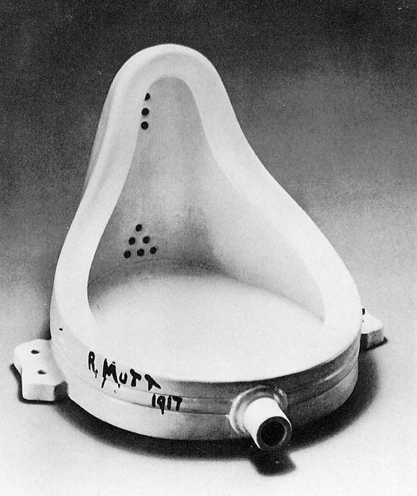
Marcel Duchamp was a French artist from the 1900's whose art reflected periods ranging from Post-Impressionism to Dadaism. The main idea of many of his works was to disrupt the idea that artist have to create their art. He did this by taking objects already created and putting his title as an artist on them.

Bicycle Wheel

Overall Impression
Although such a move is quite effective in making people see the indifference of the Dada movement, and made them think more about the piece with their mind rather than focusing on its aesthetic appeal, I find his pieces ridiculous. The disregard that he gives artists who actually spend time on their work is disrespectful in a manner.

L.H.O.O.Q.

Fresh Widow

Fountain

In advance of the broken arm


Closing Thoughts
Duchamp's work attempts to get viewers to think about his pieces with their mind rather than focusing on how nice the composition would be. But by taking regular objects and signing them (sometimes not even with his own name), he dismisses the work that was actually put into these pieces and ridicules them.

Sources

  • http://en.wikipedia.org/wiki/Marcel_Duchamp
  • http://www.egs.edu/library/marcel-duchamp/biography/
  • http://www.moma.org/learn/moma_learning/themes/dada/marcel-duchamp-and-the-readymade